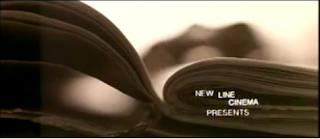
 Our text in our opening sequence uses iconic conventions for real media products. The font is damaged and disjointed in a dark red colour. With our genre as a thriller/horror, the titles show ideas of blood, death and danger reinforcing our narrative which allows the audience to be aware of what is in store.
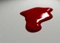 We used iconography such as mirrors, blood and dolls. We took influences from film noir and 'The Black Swan'(Darren Aronofsky, 2010) to help build on our ideas of using a mirror to show split personality and the ch
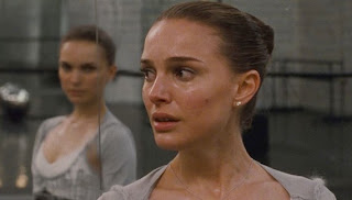 aracter's inner turmoil. We used an effect called 'Four-point garbage matte' to create an image of a reflection of a girl in a mirror, even after she has turned away.
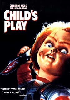
As used in horrors we used the idea of blood, using red as the only colour in an all black and white piece. Our titles are in a deep red and we used 'Colour Pass' to show our protagonist smearing red (blood) all over a wall as if possessed. In our narrative we see a girl gradually going insane after finding dolls in her house. In our opening sequence we featured two dolls; still and moving. The fact that the 'evil' in our piece comes from a doll challenges the idea of a strong male figure being the antagonist. In our research we looked at the film 'Child's Play' (Tom Holland, 1988) and some of its sequels. We dislikes the look of the dolls in these films, so chose something more sophisticated and feminine.
 The majority of the films we analysed for our researched were in colour, we used black and white. The look of our piece is quite artistic. By using black and white we could pick out red as a stereotypical colour for our genre. 'Silent Hill' (Christophe Gans, 2006) was the first title sequence that inspired us to use black and white. The colours made our images look eerie and sinister which would add to the tension and drama in our piece.
No comments:
Post a Comment