AS Production Group 13
Tuesday, 10 May 2011
KS: NAVIGATION
EVALUATION
Question 1-http://twgsbmedia11asgroup13.blogspot.com/2011/04/ks-evaluation1.html
Question 2-http://twgsbmedia11asgroup13.blogspot.com/2011/04/ks-evaluation-2.html
Question 3-http://twgsbmedia11asgroup13.blogspot.com/2011/04/ks-evaluation-3.html
Question 4-http://twgsbmedia11asgroup13.blogspot.com/2011/04/ks-evaluation-question-4-audience.html
Question 5-http://twgsbmedia11asgroup13.blogspot.com/2011/05/ks-evaluation-5-final-audience-research.html
Question 6-http://twgsbmedia11asgroup13.blogspot.com/2011/04/ks-evaluation-4.html
Question 7-http://twgsbmedia11asgroup13.blogspot.com/2011/05/ks-evaluation-67.html
(PART 2 of 7 still to come)
FINAL OPENING 'The Dolls House'
http://twgsbmedia11asgroup13.blogspot.com/2011/04/dolls-house.html
PRELIMINARY
http://twgsbmedia11asgroup13.blogspot.com/2011/03/preliminary-task.html
WILDERNESS WOODS (LOCATION RECCE)
http://twgsbmedia11asgroup13.blogspot.com/2011/02/wilderness-woods-cut1.html
Monday, 9 May 2011
Evaluation Question 7
With our preliminary task, we were very much experimenting with our use of sound and effects. We used one of the schools tracks as our sound, simply placing it into the time line, on top of our footage without too much thought. However, in our final piece I went to a studio, recorded my own sounds and mixed it so it would fit our final edit exactly. I recorded myself singing, laughing and screaming as well as making sound effects such as scratching metal and screwing up paper.
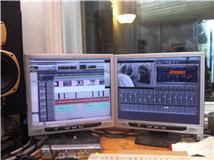
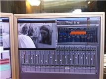
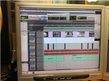
The software I used to do this was 'Pro Tools', this is a professional software that allowed me to be creative with my mixing. I spent two days in the studio to come out with the final product, I feel that the way I used sound and edited improved dramatically from the preliminary task. After recording each sound, I took the front seat in cutting each track down and then placing it appropriately on the time line. I had to make sure I cut each track precisely so it matched the video exactly. This job was made harder by using montage editing as the cutting rate was so fast.
In our preliminary task we played with the effects that we may want to use in our final piece. After looking at opening sequences such as 'Vertigo'(Alfred Hitchcock,1958), we thought that a colour wash of red on our piece might work. To create with wash we used an effect called 'Channel Mixer'. The use of red brought strong iconography from our chosen genre and gave a more sinister look to our footage.
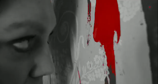
After doing more research we decided to choose a black and white colour scheme. We liked the idea of our footage looking old and distressed. We wanted to use symbolism of red though. The text in our opening sequence is blood red and we used an effect called 'Colour Pass' in some of our footage; this allowed us to pick out the colour red whilst still having the majority of the image in black and white.
For our preliminary task we used continuity editing. We experimented with a mixture of angles and shot sizes to achieve a variety of perspectives in our piece to make it more interesting. We found that when editing our footage, each clip had to be cut at exactly the right point so that the line of action in each clip did not overlap. Pauses between cuts had to be removed to give the illusion that are queues were one continuous dialogue. Because of errors in using the camera incorrectly (not pressing record!) and a vast amount of wardrobe changes across a few days, we had to re-shoot some of our footage. Everything in each shot had to match up to the next e.g. the background, the hair, the costume.
Whilst researching film openings, we found 'Se7en'(David Fincher, 1995). We loved the use of montage editing and the use of close ups in the piece. We wanted to use our opening sequence as a window into our character's twisted mind; we thought montage editing would help us achieve this. With montage editing we had to do considerably more storyboarding. Our preliminary task was around a minute long with very little different shots when compared with our final piece. Because we used montage editing our cutting rate was fast. This meant we had to draw several pages of storyboards. Our storyboards were much more detailed the second time round. Not all of our initial ideas could be used in our final piece though. One of our original ideas was to show a mirror smashing on the floor; for safety reasons this was not possible.
Sunday, 8 May 2011
LH: Evaluation Question 6
Throughout our coursework we have been using blogger to showcase our work. We set up our own blog, designing its layout ourselves. We collaborated on posts and commented on each others private work. We used youtube for some of our research, embedding videos onto the blog where appropriate. As well as youtube, we used websites such as watchthetitles.com and artofthetitle.com for our research. These helped us to build on our own idea whilst showing us how different films within a genre can be.
For our piece we used a Nikon SLR camera for filming. It produced:
- great quality pictures,
- HD filming and sound.
- The zoom was 18-55 mm, and allowed us to do some great shots.
Throughout our piece we had to make sure to always film with the camera landscape. So all of our footage would match up to the size of the screen, we could shoot portrait. One of our early mistakes was to shoot in both layouts. Instead of proving our photos useless, we fixed the problem by zooming in on them so they met the edge of the screen.
Use of Premiere 8
To edit our footage we used 'Premiere 8'. These were the steps we used to make our film opening:
- The first step to editing our footage was to upload everything we had shot onto 'Premiere 8'. Once everything had been uploading we looked at everything we had decided on which we wanted to use in our final piece. Whilst filming, we always wanted to shoot too much rather than just a little.
- We then watched some of our footage back on the computer, we realised that some of it was unsuitable to use in our final edit. Once we had all of our footage, we could start editing.
- To edit our footage, we had to drag each clip one by one onto the time line. We then had to create an order for all of our footage.
- We decided to edit everything in one location together, separating each location by a common clip. Throughout our piece used an extreme close-up of the girls face to create a separation between each location, giving the impression that each location, each memory is deeper inside her mind. These clips helped to define the line of narrative more clearly.
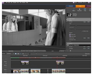
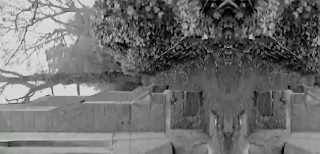
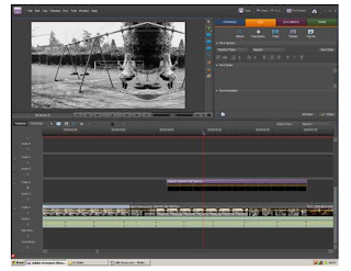
Effects we used with Premiere:
Use of Pro Tools
For our piece we wanted to create our own original sound. To do this we went to 'Blizzard Records' and used the studio. We had a strong idea of what we wanted in our sound; a number of different sound effects that would all build together to create a crescendo at the end of our piece. To edit and record our sound we used a software called 'Pro Tools'. In the studio we recorded each sound separately, created different tracks on the computer. This allowed us to edit each sound individually, tailor-making the soundtrack exactly for our piece. The sounds we recorded where:
LH: Evaluation Question 4/5
What were your favourite parts of the opening?
"I liked the part were the girl was looking in the mirror and you could still see her reflection, that looked really good and professional. I really liked the girl singing and laughing, it was really creepy. And the scream at the end, there was a nice build up to it"
What did you think was bad about the opening?
"No, I thought it was all really good"
Did you understand the narrative? What was it about?
"I think so. It was about a teenage girl. It showed the girls memories or her dreams? And the doll in the video was evil and had brainwashed her"
Would you go watch this film in the cinema?
"I definitely would. If I was old enough"
LH: Evaluation Question 3

Saying this, the majority of our feature would demonstrate mainstream themes. Our piece mainly attracts a teenage audience, the majority of which would be female. This is because the main character can be more related to them. However, we have stock characters that would appeal to other audiences. Our film would provide a lot of the conventions of a traditional psychological thriller; it involves murder, inner turmoil, unstable characters and iconography. Although the family featured in our piece would be predominantly middle-class, we feel that a selection of cultural backgrounds would enjoy our film.
As this is the case I think a platform release would be suitable for our film. I think this because it may not be marketable worldwide, so choosing locations where similar films have known to be acceptable would be the easiest and safest option. Another idea though would be to have a blanket release. We would create a buzz about the film using twitter and facebook to connect to a wide audience. We would use posters and teasers to showcase our idea and create a buzz factor. Is this was our strategy we could potentially get backing from a conglomerate like Warner Bros. or like 'Silent Hill'(Christophe Gans, 2006) use Columbia TriStar. For companies like this, our film would be exhibited in cineplexs like 'Odeon'.
LH: Evaluation Question 2
 In our soundtrack we used giggling and singing to show her insanity. We feature a nursery rhyme style song that adds a creepy edge to the imagery on the screen. The lyrics bring everything in the piece together creating a line of continuous action. The music makes her seem a lot younger and shows her as someone who is also playful and fragile. This challenges the stereotypical idea of a teenager as they are seen as strong, argumentative and loud but we show her as someone who is broken.
 In horror films, the female teenager is shown as the target and as a victim. In our piece, however, she is the murderer. The most common antagonist is usually a male. We wanted someone who we could relate to and someone who was accessible to us to use in our piece. The antagonist is someone who can overpower their victims and is seen as somewhat threatening. We wanted to use the idea of the murders being performed in the spur of the moment with the element of surprise. This would give our otherwise weak character, an edge with spontaneity and a burst of adrenaline. It did however fall to the stereotypical view of a female being quite weak, especially when compared with a dominant male figure.
LH: Evaluation Question 1
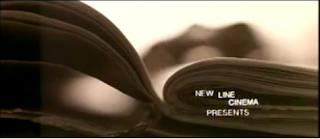 Our text in our opening sequence uses iconic conventions for real media products. The font is damaged and disjointed in a dark red colour. With our genre as a thriller/horror, the titles show ideas of blood, death and danger reinforcing our narrative which allows the audience to be aware of what is in store.
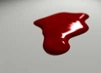 We used iconography such as mirrors, blood and dolls. We took influences from film noir and 'The Black Swan'(Darren Aronofsky, 2010) to help build on our ideas of using a mirror to show split personality and the ch
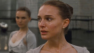 aracter's inner turmoil. We used an effect called 'Four-point garbage matte' to create an image of a reflection of a girl in a mirror, even after she has turned away.
As used in horrors we used the idea of blood, using red as the only colour in an all black and white piece. Our titles are in a deep red and we used 'Colour Pass' to show our protagonist smearing red (blood) all over a wall as if possessed. In our narrative we see a girl gradually going insane after finding dolls in her house. In our opening sequence we featured two dolls; still and moving. The fact that the 'evil' in our piece comes from a doll challenges the idea of a strong male figure being the antagonist. In our research we looked at the film 'Child's Play' (Tom Holland, 1988) and some of its sequels. We dislikes the look of the dolls in these films, so chose something more sophisticated and feminine.
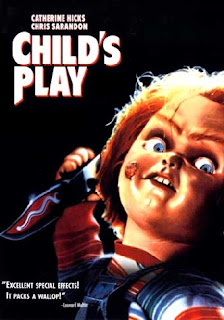 The majority of the films we analysed for our researched were in colour, we used black and white. The look of our piece is quite artistic. By using black and white we could pick out red as a stereotypical colour for our genre. 'Silent Hill' (Christophe Gans, 2006) was the first title sequence that inspired us to use black and white. The colours made our images look eerie and sinister which would add to the tension and drama in our piece.

 Use of Camera